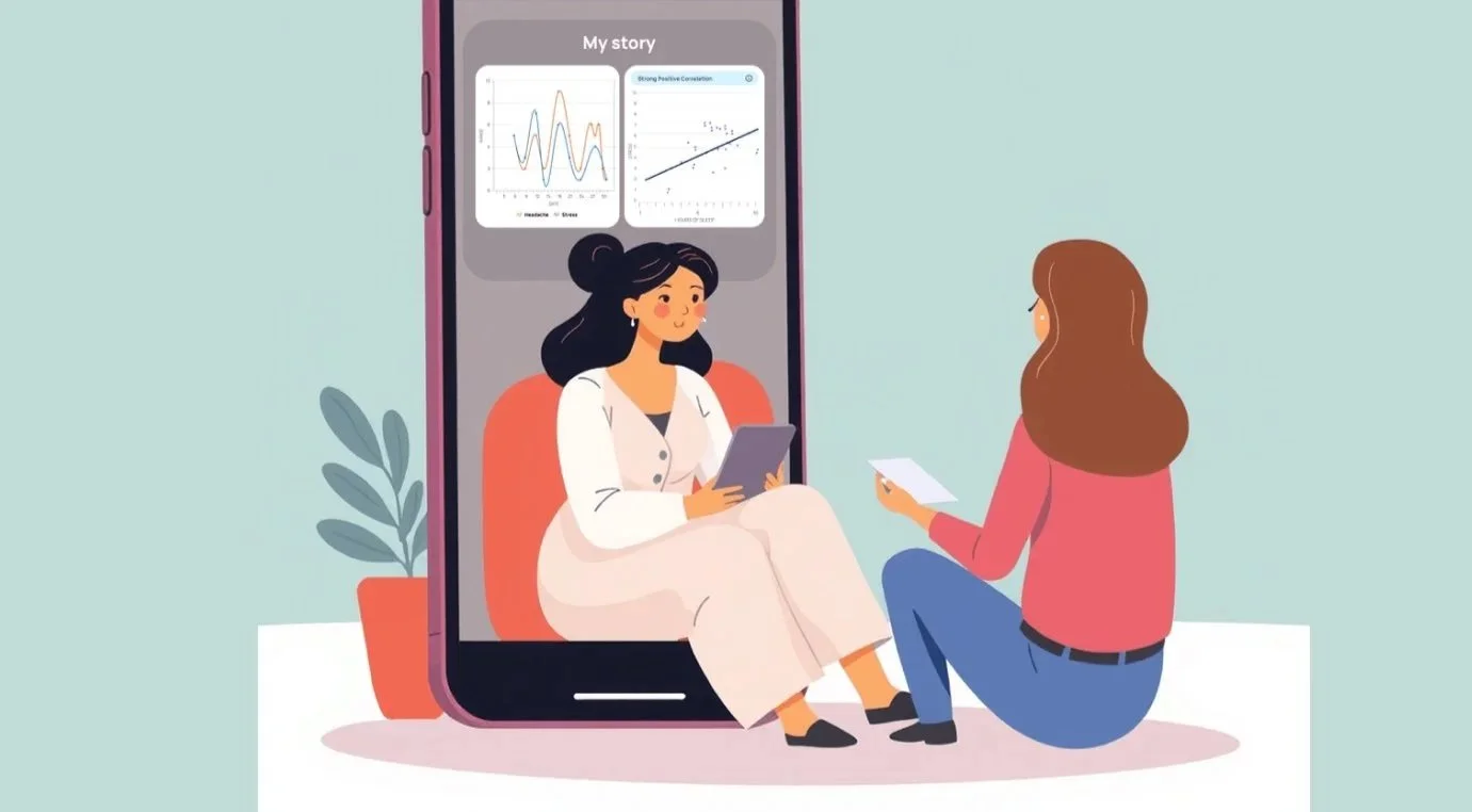
Ourself Health
From Placeholder to Production: Designing a Wearable-Ready Health Metrics System for Ourself Health
Project Type: UX / Product Design for Health Tracking Platform
Duration: 4 weeks, December 2025
Role: UX Designer & Consultant
Tools: Figma, user research, comparative analysis
Ourself Health needed a fitness tracking interface that could support both interim manual placeholders and direct integration with Apple Health and Fitbit once device syncing was available. To avoid rework and ensure engineering alignment, I developed a UI replication of Apple Health and Fitbit metric patterns, matching structure, units, and aggregated values across all tracked metrics.

The Challenge - Consistency Across Platforms
Ourself Health’s product team required exact visual and data structure replication of Apple Health and Fitbit’s tracking interfaces so that future integrations would not require redesign. Many health metrics (like gait cadence, asymmetry, and speed) are device-derived and not intuitive for users to self-report, yet the UI needed to account for both temporary manual states and eventual automatic syncing. This created a unique constraint: no original UX patterns, only replication of existing platform conventions to support engineering integration.
Research & Analysis
To inform this replication work, I conducted a comparative platform audit of Apple Health and Fitbit interfaces. I documented how each metric is:
measured
aggregated (daily summary vs per session)
represented visually and in units
expected to behave when device data is available
For example, step cadence in Fitbit is calculated continuously during activity and shown as a daily average (steps/min), while Flights Climbed is a cumulative daily count. Understanding these patterns was essential for classifying metrics and defining interface behavior.
AI-Assisted Research:
Throughout the audit of Apple Health and Fitbit, I used ChatGPT as a thinking partner to help clarify how different metrics are defined, measured, and displayed. It was especially helpful for working through the differences between similar concepts like cadence, speed, and asymmetry, and for pressure-testing whether my interpretations matched how these platforms actually behave. This allowed me to move faster while staying grounded in accuracy and consistency.
Design Strategy
Based on the audit, I developed a metric classification model to guide design decisions:
Device-derived, read only daily summaries — metrics like cadence and wheel speed that come directly from sensor data and should appear as static, aggregated values when available.
Manual placeholder aggregations — metrics like Heart Points or Move Minutes that accumulate over the day and can be represented as numeric totals in the interim, mirroring Fitbit’s pattern.
Core principles included:
matching units exactly (e.g., steps/min, mph, points)
using a single daily aggregated value per metric
applying consistent UI components
distinguishing clearly between placeholder data entry and read-only device data states
AI Decision Support:
I used ChatGPT to talk through design decisions as constraints evolved and to make sure my thinking stayed aligned with the goal of exact platform replication. It helped me articulate why certain metrics needed to be read only, why others could act as placeholders, and how to describe those choices clearly for product and engineering. It functioned as a space to refine logic and confirm that the structure of the system made sense before committing designs.
Design Execution
For each metric, I mapped the corresponding Apple Health or Fitbit representation and ensured the UI adhered to:
Terminology and units used by the original platforms
Presentation patterns (e.g., daily summary cards)
Interaction expectations (e.g., read-only vs placeholder entry)
Examples:
Heart Points: mapped to a single daily numeric value, formatted exactly as in Fitbit.
Step and Cycling Cadence: surfaced as daily aggregated values (steps/min and RPM), rendered read-only to match Fitbit’s pattern.
Walking Steadiness & Asymmetry: reframed into daily counts or daily summaries to align with existing UI while still mirroring platform behavior.
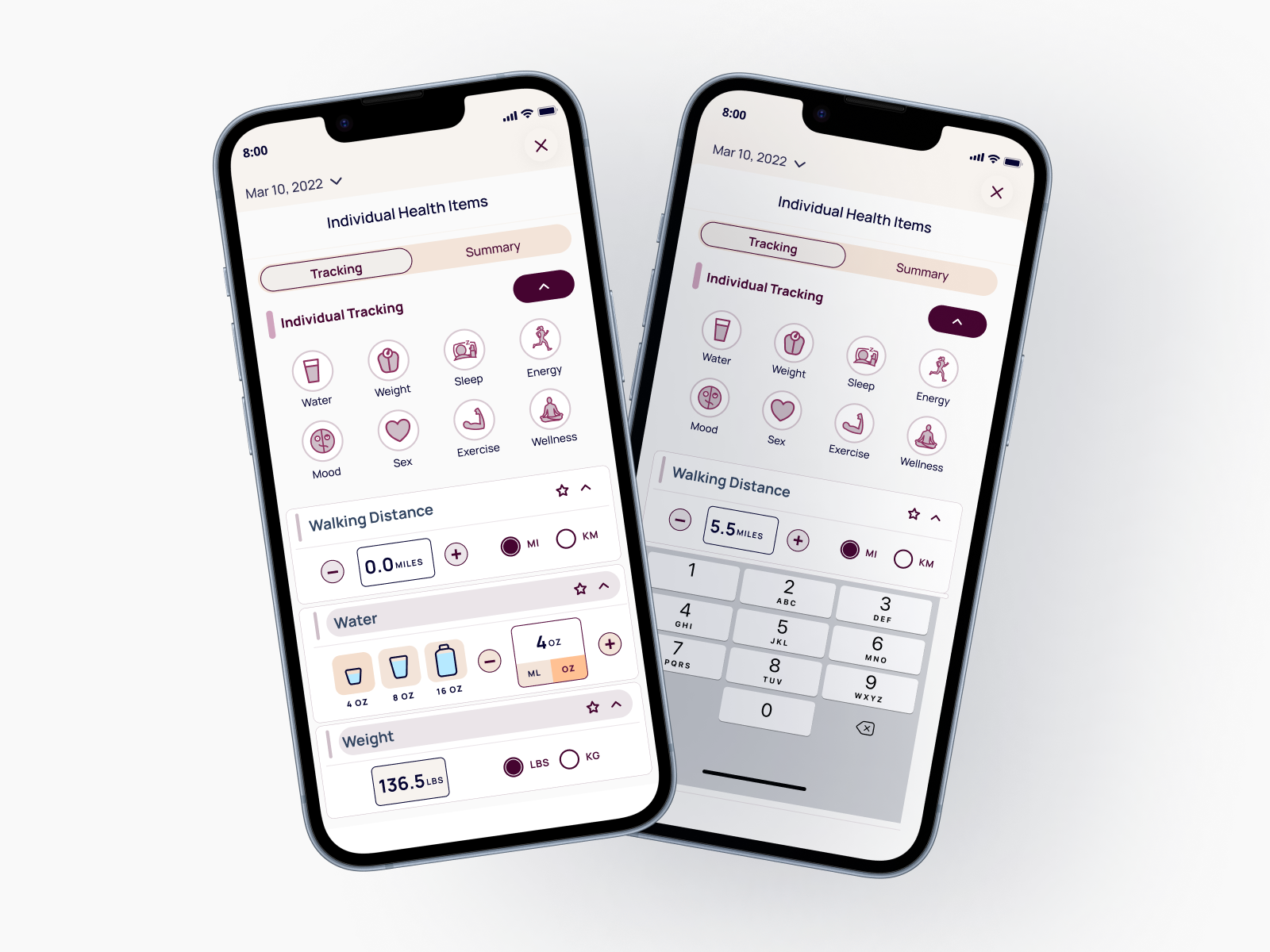
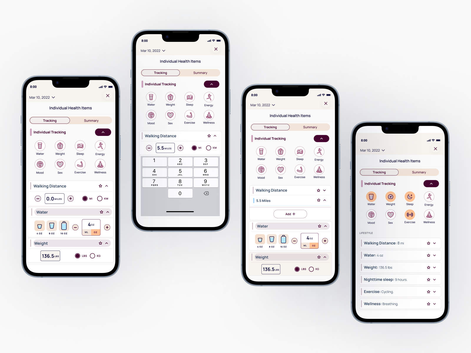
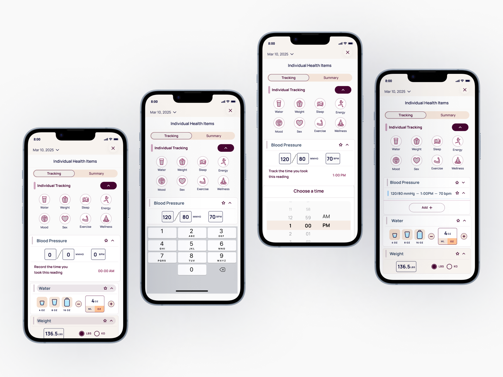
Final Designs
The designs below show the the Ourself Health replicas final designs. They include original at a entry states, collapsed summary states, and expanded placeholder or read only states to show how units, structure, and aggregation patterns were matched for future device integration.
In total, I completed 21 finalized metric designs, each built to mirror Apple Health and Fitbit patterns.
ChatGPT supported this phase by helping refine unit labels, summary text, and microcopy so everything stayed consistent as the system scaled.
Walking Distance
Blood Pressure
Takeaways & Next Steps
Outcome 1 - Deliverable impact:
21 integration-ready metric designs delivered in 4 weeks, each mapped precisely to Apple Health and Fitbit conventions — eliminating the need for a redesign sprint when device syncing goes live and giving engineering a direct, unambiguous UI reference for platform integration.
Outcome 2 - Strategic impact:
The metric classification model developed during this project became a reusable decision framework for the product team, providing a clear system for categorizing future metrics as device-derived or manual placeholder — reducing ambiguity in cross-functional handoffs between design and engineering.
Reflection
This project helped me get stronger at working within tight product constraints while still producing clear, usable designs. And it reinforced how important accuracy and consistency are when designing for health data and external platforms. It also showed me how useful AI can be as a design support tool, helping me think through complexity, validate decisions, and communicate more clearly with the team.