Green Chef
13% Retention Increase: Redesigning Onboarding to Keep Green Chef Subscribers Engaged
Project Type: UX/UI Design for B2C Subscription E-commerce
Duration: 2 weeks, August 2020
Role: UX/UI Designer
Tools: Sketch, InVision, pen and paper
Location: Boulder, CO
The Client
As the #1 lifestyle meal kit service, Green Chef delivers restaurant quality, easy-to-cook meals right to your doorstep. They stand out with chef curated recipes using organic, sustainably sourced ingredients. Green Chef caters to specific diets: keto, paleo, vegan, and vegetarian. They bring a health niche to a quickly moving market for meal kits service.

The Challenge
New Green Chef customers lack guidance on managing their account and placing their first order. This transition from prospect to active customer isn't adequately addressed. Additionally, the main account page interface is cluttered and outdated, making navigation unintuitive and key features hard to find, unlike Green Chef's competitors.
My Role
As a UI/UX Designer on the Green Chef product team, I was responsible for: Competitive analysis of meal kit onboarding experiences and data analysis of user surveys and cancellation feedback.
Card sorting exercises with active users to prioritize account features
User persona development and wireframing from concept to high-fidelity prototypes
Usability testing with new and existing customers to validate design decisions
Custom graphics creation and microcopy writing for tutorial clarity
Cross-functional collaboration with Product and Engineering teams to deliver retention-focused solutions
Research
I thought it was important to explore the experience and expectations of Green Chef subscribers, gathering data from new and recently subscribed users. The focus: understanding sign up questions, subscription expectations, reasons for cancellation, and how to bridge the gap between prospective and committed customers.
Data Insights
Data were gathered from Green Chef customers from when they were signing up for their account and also cancelling.
#1. Top reasons customers cancel
#2. Most frequently asked questions when sighing up
Card Sorting Results
I then created a card sorting exercise given to active users, I wanted to better understand the importance of the functions related to their account. The results below helped give insight in this area.
#1
Select current week’s menu
Select next week’s menu
Update delivery date
#2
Review price
Select preferences
Contact Customer Care
#3
Review recipe card
Skip a week
Refer a friend incentives
Persona
The final step in the research phase was knowing who our common user was. From current data, I created a persona to predict common user navigation patterns:

Everly, 35 years old
Household income $110,000
Bachelor’s degree
Working professional
Cooks dinner for her family 4 times a week
“Health and nutrition are important to me and my family. Balancing my busy career and taking care of my family are my main priorities”
Research Findings
With a full account page redesign months away, I proposed an onboarding tutorial to enhance user experience and improve retention. Analyzing survey data and card sorting insights, I was able to further identify the most crucial account features. The tutorial aims to guide new users through their first order and subscription management, addressing company needs by targeting factors influencing user satisfaction and retention.
Scope - Defining the project
Within-Scope:
Tutorial for early user experience on the main account page
Focus on features driving customer value and early retention
Out-of-Scope:
Tutorials for all features
Entire customer journey experience
On-boarding review feature
Benefits of a tutorial:
Improved customer satisfaction and account management
Higher retention through better subscription utilization
Risks:
Potential user annoyance leading to account cancellation
The Design
Coach Marks Wireframes - First try!
The first concept explored a guided onboarding flow using coach marks to orient users to key actions within the Green Chef experience. These wireframes translated the primary steps identified during the research phase into a sequential tutorial.
Tutorial steps included:
Select menu week
Pick your recipes
Weekly order summary
Subscription details
Edit an individual week
After user testing, it became clear that introducing coach makes an interface increased cognitive load and risked user confusion. Rather than clarifying the experience, the overlays competed with core content and actions.
Based on this feedback, I decided to abandon this interaction pattern and explore a different approach to onboarding that reduced visual noise and better supported task completion.

Carousel Wireframes - New design direction after first attempt failed
After the first set of wireframes did not making the cut, I landed on a carousel approach. I was aiming for a comfortable, non-overwhelming introduction. From these wireframes, we moved to a high-fidelity prototype, with the following changes to be made.
Changes included:
Streamlined copy
Reduced steps
Removed cut-off date from first step
Updated overall design
Adapted for desktop

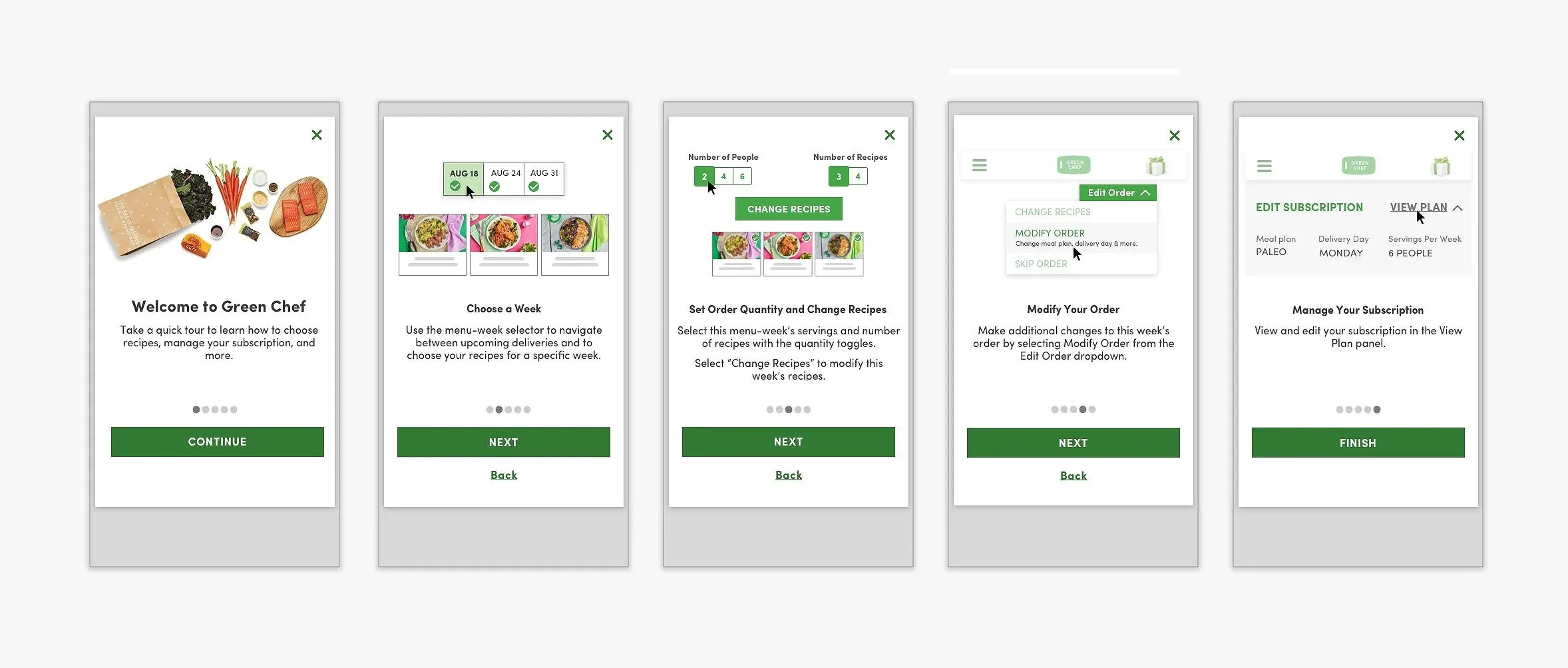
Final Design
The refined tutorial has five steps:
Welcome page
Select a Week
Set Order Quantity and Choose Recipes
Modify a Week
Edit Subscription
This approach addresses the key user concerns while guiding them through their first order, tackling previous pain points that led to cancellations.
Mobile

Desktop

Image Graphics
I then created lightweight graphics to illustrate each step, making the tutorial more intuitive.
Mobile

Desktop

Results and Impact
Outcome 1 - Business impact:
The onboarding redesign contributed to a 13% increase in user retention and a 15-point NPS improvement, directly addressing the cancellation drivers surfaced in user research and demonstrating measurable business impact from a research-driven design approach.
Outcome 2 - Process impact:
By recognizing that the initial coach marks approach increased cognitive load and pivoting to a carousel model, the final design reduced friction during first order completion, the most critical moment in the customer journey, establishing a framework that influenced future onboarding development across the platform.
