Original Site
Scroll to explore
Case study · Nonprofit
The members' site had a navigation problem everyone already knew about. My job was to fix it. I surveyed 53 members, restructured the site's information architecture, redesigned the homepage, reorganized 35 pages of content into a focused mega menu, and brought the community's most-needed resources to the surface.
1
The Challenge
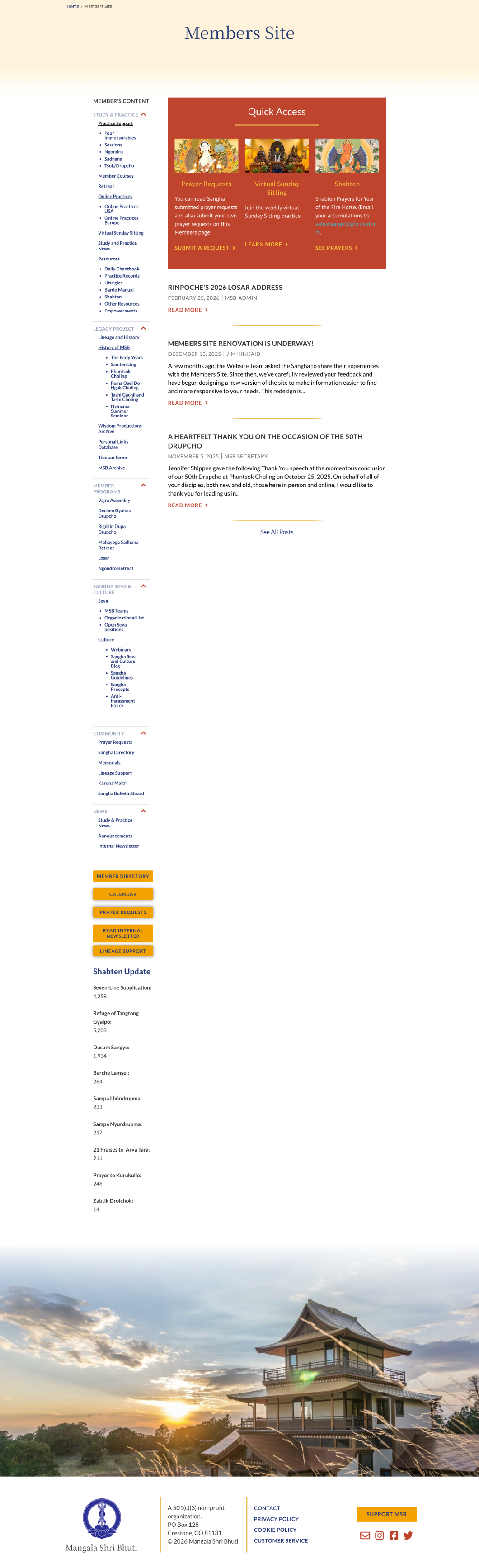
The members' site had a collapsible sidebar with six sections and dozens of nested links. Members were visiting regularly. Survey data showed 84.9% came for Study and Practice materials. But finding anything required effort. The search function consistently failed. Course materials were buried. The structure was getting in the way of people who already knew what they were looking for.
Original Site
Fig 01. Original members' site: six collapsing sidebar sections with dozens of nested links
2
Research & Discovery
I conducted a member survey reaching 522 people with a 10.1% response rate: 53 members. The data was consistent. Study materials drove visits (84.9%), followed by Member Programs (75.5%) and Member Directory (45.3%). When asked what frustrated them, members cited navigation and search failures. A lot of content was just buried.
When asked for improvements, navigation and table of contents appeared repeatedly. Members wanted faster access to the resources they already valued.
Ease of Finding Information
Fig 02. How members rated their ability to find information on the site
Top Frustrations by Members
Fig 03. Primary frustrations reported in the member survey
The survey asked members directly what brought them to the site. Three categories accounted for the majority of visits, and none were easy to find in the existing sidebar structure.
84.9%
The clear majority of visits were for practice support: liturgies, instructions, online sessions, and course materials. These were buried three levels deep in collapsing sidebar menus.
75.5%
Program information, registration, and schedules were the second most-visited category. Members had to know exactly where to look. Discoverability was near zero for anyone new to the site.
45.3%
Nearly half of members visited for the directory, one of the most consistently hard-to-find pages. It appeared in a collapsed sidebar section with no homepage shortcut.
Key Research Findings
3
Design Strategy
The survey made the pattern hard to miss. Members weren't asking for more content, they wanted faster access to what they already used. So I reorganized 35 pages into seven categories built around how members look for things: Practice Resources, Study, Community, Archive, Programs, Seva, and News.
I redesigned the homepage around direct access to high-value resources. Dedicated cards surfaced the most frequently used destinations so that key member tasks were available without navigating multiple levels deep into the site.
Stakeholders also wanted to increase visibility for important community resources. Additional homepage cards highlighted Giving, the community Photo Album, and Wisdom Productions, providing easier access to livestreams, recorded teachings, and digital learning resources.
The visual design introduced photography of sangha members and Buddhist imagery throughout. The previous site felt functional but generic. The redesign aimed to create a stronger sense of belonging and better reflect the community the site was built to serve.
AI-Assisted Research Synthesis
I used Claude to synthesize the open-ended survey responses, which freed me up for the information architecture and design decisions.
Constraint
The WordPress theme wasn't changing. That was fine. It meant the work had to live in the information architecture, the homepage design, and the visual direction. Which is where the real problems were anyway.
Homepage
A dedicated resources section on the homepage gave members direct access to My Courses, Online Practices, the Member Directory, monthly dues, and other frequently used resources. These destinations had previously required navigating several levels deep into the site. Bringing them to the homepage made key member tasks immediately accessible and was one of the most impactful changes in the project.
Mega Menu
I reorganized 35 pages into 7 categories based on how members look for information. The new structure prioritized common tasks and frequently used resources rather than the site's internal content hierarchy.
Visual Design
Adding photographs of members and Buddhist iconography throughout the site changed how it felt. The previous design had been functional but cold. Members are visiting a site that supports their practice and their community. It should feel that way.
Before

After

Fig 04. Mobile — original site (left) and redesigned homepage (right)
Before

After
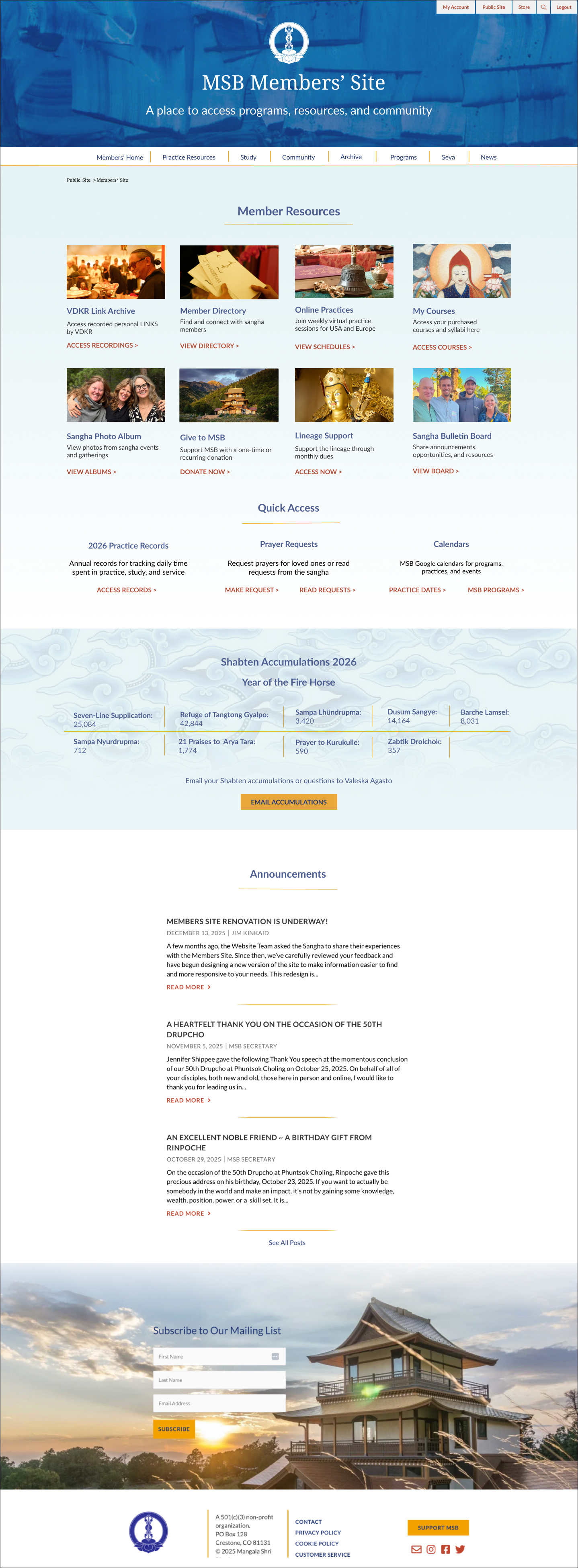
Fig 05. Homepage before and after: sidebar navigation replaced with quick-access cards and mega menu
4
Design Execution
I started with wireframes in Figma to move through the structural decisions before going into high-fidelity mockups. Once the architecture felt settled I worked through each mega menu section in detail. I paid attention to the button labels throughout. VIEW for browsing, ACCESS for gated content, DONATE for transactions. Consistent labeling made each section more scannable and reduced the cognitive load that had been frustrating members.
Version 1
The first version grouped all study and practice content into one mega menu column. It was too much. Stakeholders flagged it and they were right. There was no clear hierarchy and the section felt hard to navigate.
Revision
Separating them into Courses and Practice Resources made the distinction clear. Courses for structured learning, Practice Resources for daily and ritual materials. It was easier to read and easier to use. I revised without hesitation.
Removing the sidebar was already agreed. The harder question was what to replace it with. With 35 pages of content and members visiting for a wide range of reasons, the challenge was how to surface what mattered without making everything else harder to find. The mega menu handled the depth. The homepage cards handled the frequency. Together they gave members two ways in depending on what they needed.
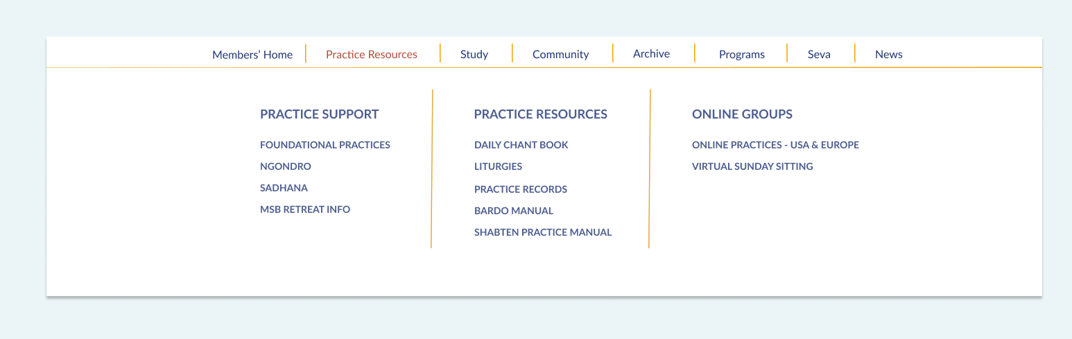
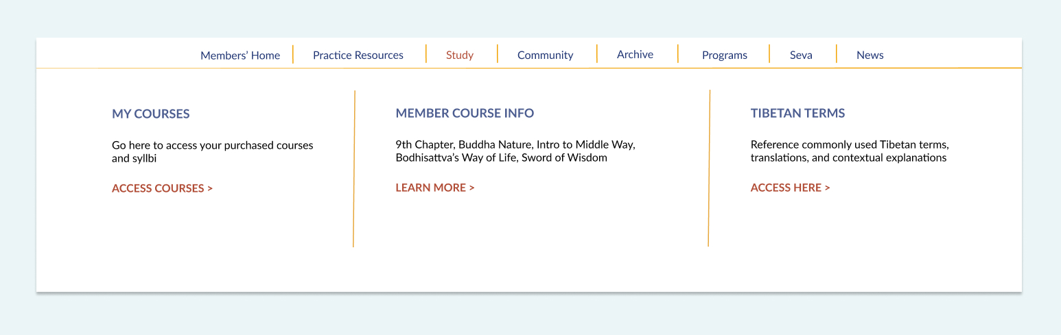
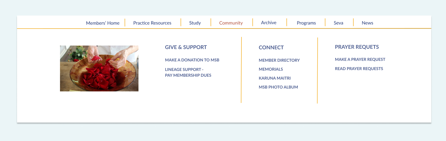
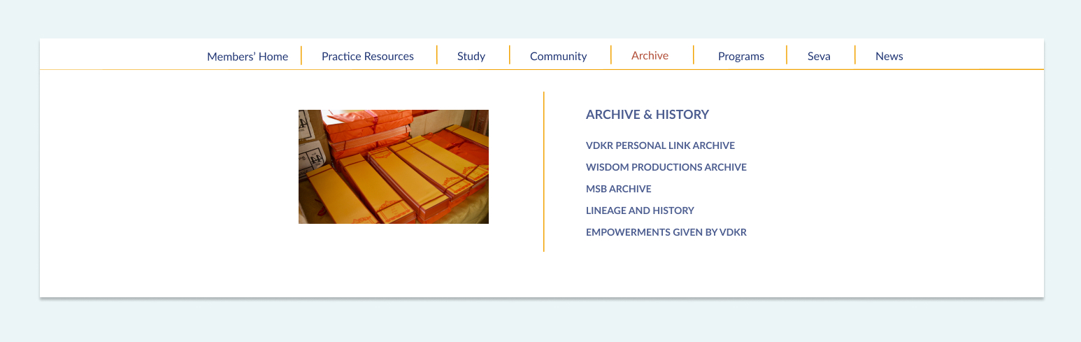
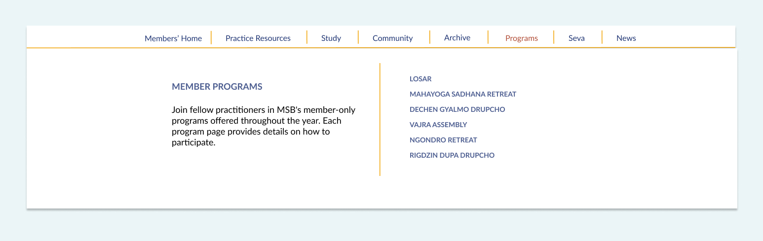
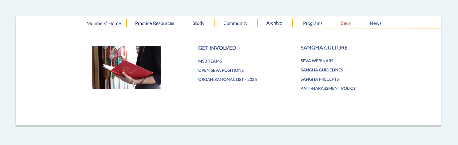
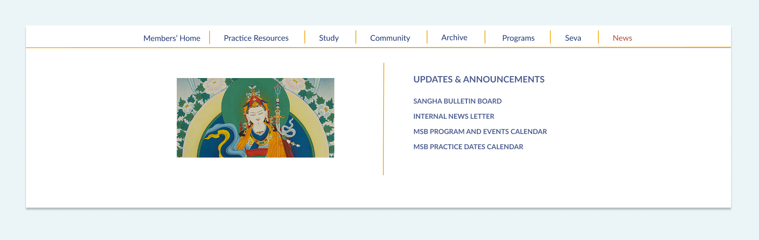
Fig 06. Desktop mega menu — 7 categories organized by member intent. Tap arrows to explore each section.
Fig 07. MSB Members' site homepage final design
5
Outcomes
Reflection
The survey changed my understanding of the problem. Members valued the content and visited the site regularly. The issue wasn't a lack of resources. It was the effort required to find them. Improving navigation, information architecture, and content discoverability had a greater impact than adding new features or content.
Using Claude to synthesize the survey data meant I could spend my time on the design decisions rather than sorting through qualitative responses. That freed up energy for the parts of the project that needed my judgment.
Stakeholders flagged the homepage as too crowded, and they were right. I went back and simplified it. I think being straightforward about that revision made the rest of the project go more smoothly.
If I did this again I would test the mega menu with members before finalizing. Stakeholder feedback was useful but watching someone try to find what they need tells you something different. User testing would have validated the category names against real mental models and might have caught naming issues before the site went live.